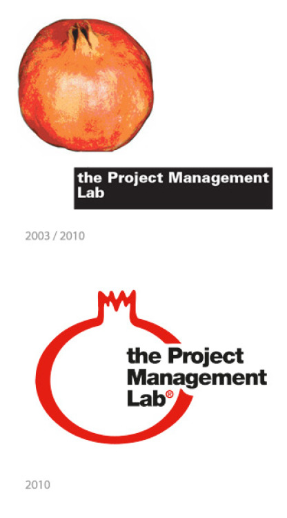
We wanted to tell you briefly why we chose a pomegranate as our company's logo.
The pomegranate is a very ancient fruit that over time has travelled the globe.
It is a symbol of fertility, plenty, temptation and immortality.
It appears in the mythology of many cultures.
In literature it is celebrated as a magical fruit that has a wealth of things to offer: under the tough orange-red peel is hidden “a crystallised sky. Each seed is a star, each membrane is a sunset” (*).
The seeds are deep red, sweet and fragrant.
They look like little rubies that light each other up with their colour.
What could be better than a pomegranate to symbolise a project?
The fruitfulness of project is something precious to be discovered, its innovative aspects tempt us, and each part is valuable in its own right and amplified by interacting harmoniously with the other parts. A project is a world that shines with its own light and that must be constantly nourished to achieve results.
So...let the pomegranate be a good omen for your projects!
(*) “Oriental Song” from the Book of Poems by Federico Garcia Lorca